Designer Q and A Inspired Spaces for Children
Apr 21, 2021 | Carpet One Floor & Home
As you can imagine, designing children’s rooms can be a fun and challenging experience. Kids have a natural way of pushing boundaries and testing limits, which can be refreshing from a design perspective. We can all take some cues from the next gen when it comes to life, and we can certainly take our design approach. When my team received the task to design four rooms for sisters, that’s exactly what we did.
What was the goal for these children’s rooms?
My goal was to create inspiring spaces for the young teenage sisters to enjoy now and to joyfully grow in later. It’s a lot tougher than it sounds because the long-term success of interiors designed for kids is based on personalities and preferences that don’t exist yet.
Let’s talk color. What was the inspiration behind the color palette for this bedroom?
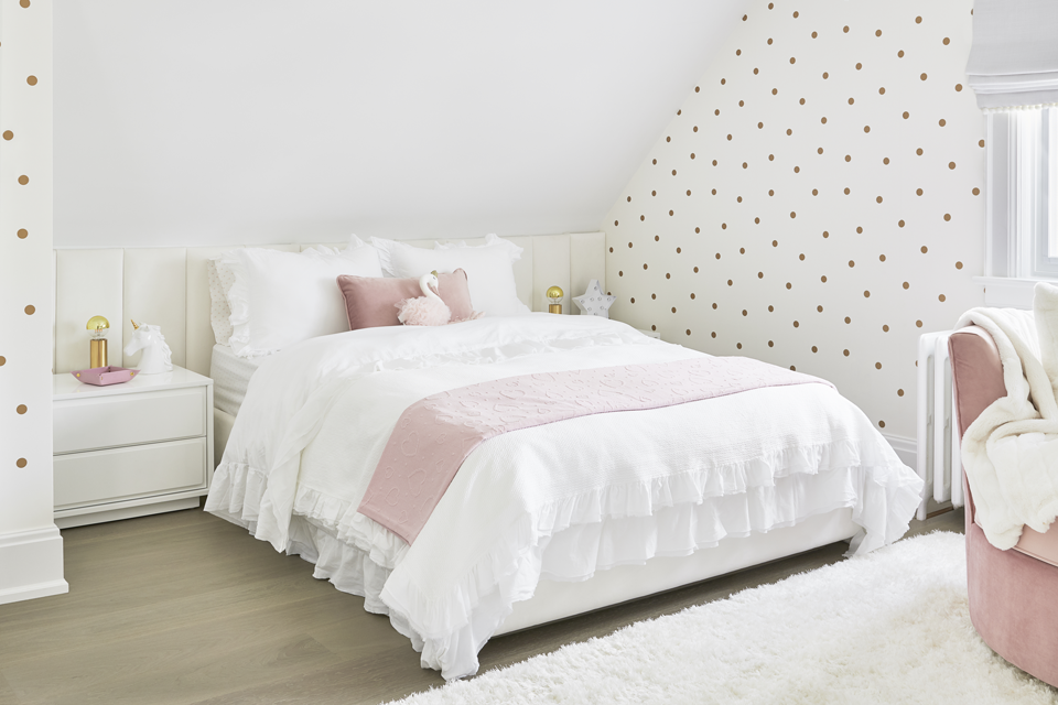
The girls shared a common love of white, which also aligned with myself from a designer’s perspective and which served as the predominant palette in each of the four rooms. White is clean and contemporary, and it has “legs,” which is a key consideration when designing a room for kids. In the face of quickly changing trends and tastes, the neutrality and versatility of white works well on all levels. It also proved easy to warm up with texture, color, and some whimsical elements.
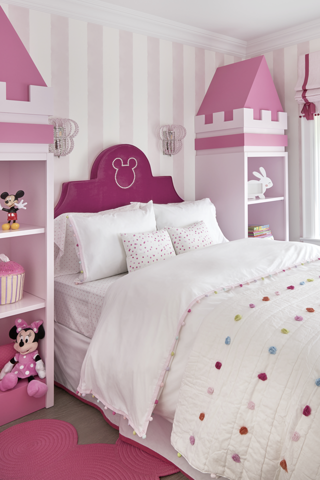
Then there’s that obvious theme of pink as the secondary fixture in these rooms, ranging from a barely-there whisper of pink to an in-your-face hot pink, Pop Art-inspired sitting corner—but more on the duo-toned sequined wall and banana swing later!
Pink often gets pigeonholed as the classic color choice for girls—sugar and spice and everything nice. I wanted to challenge that notion and showcase this versatile color’s real personality, as reflected by the preferences and personalities of each girl. The right pink can be powerful, soothing, or lively, depending on the shade and tone.
We love the multifunctional use of this space. What is your best piece of advice when it comes to making the most out of a cozy room?
“Cozy” spaces require a tailored approach that maximizes their aesthetic possibilities while balancing their practical demands. When presented with a small floor plan, I start by delineating the essential “zones” for the room—in this case, the sleeping, dressing, studying, and socializing areas. Then I layer in all the rest.
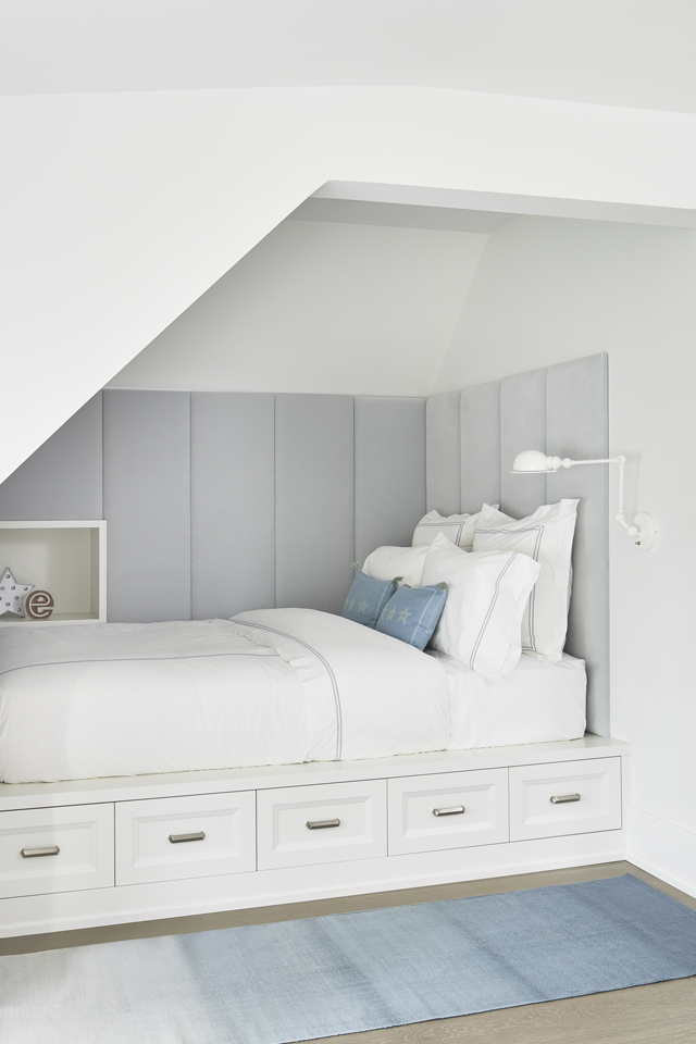
There are some uniquely angled ceilings in this bedroom. What are some tips for maximizing space when working around structural elements?
Custom built-in furniture—such as this bed and dresser/desk concept—offers the best use of space when dealing with a small room, awkward dimensions, or restrictions of any kind, such as the angled ceiling. Yes, custom work will most definitely cost more (as anything custom tends to do), but it will also fit your space like a well-tailored glove and make the most of every available inch of space.
Going custom also often leads to creative shapes in the furniture, which I love as a unique way of adding unexpected visual interest to a room.
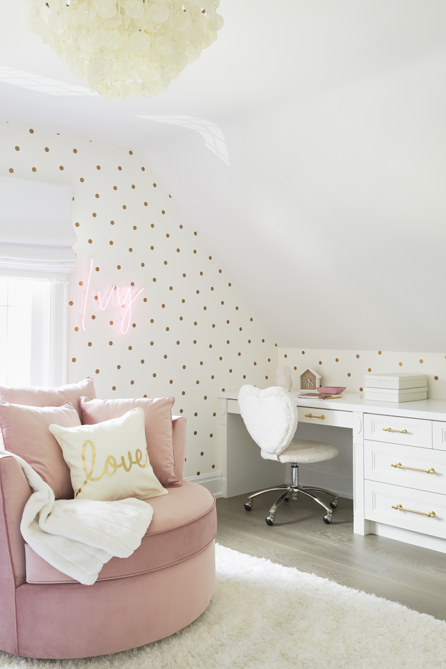
The layered textures in this room are so inviting. What are some of your favorite textures to layer in kids’ rooms?
I love a casual, relaxed vibe for kids’ rooms—and a great way to amp this up is by layering upholstery and textiles. Linen is a favorite fabric because it’s not too heavy or overbearing. I have also gravitated to large-scale cable-knits and chunky corduroys, which are texturally weighty and wonderfully comfortable to sink into.
A child’s room can be very inspiring for young minds. What were some of the elements that your client wanted to incorporate into your design?
The goal was to give the daughters a lounging area. We incorporated a cozy round swivel chair for curling up with a good book, as well as a playful shag rug where the kids can hang out with their friends.
The banana swing, first seen at the Miami Museum of Ice Cream, was also an absolute must. They fell in love with the swing and wanted to incorporate it into this room, so we had a replica created just for them. We tucked the swing into a feature bump-out that we wrapped in pink and gold flip-sequin wall panels, which aptly finish the room with some essential glam.
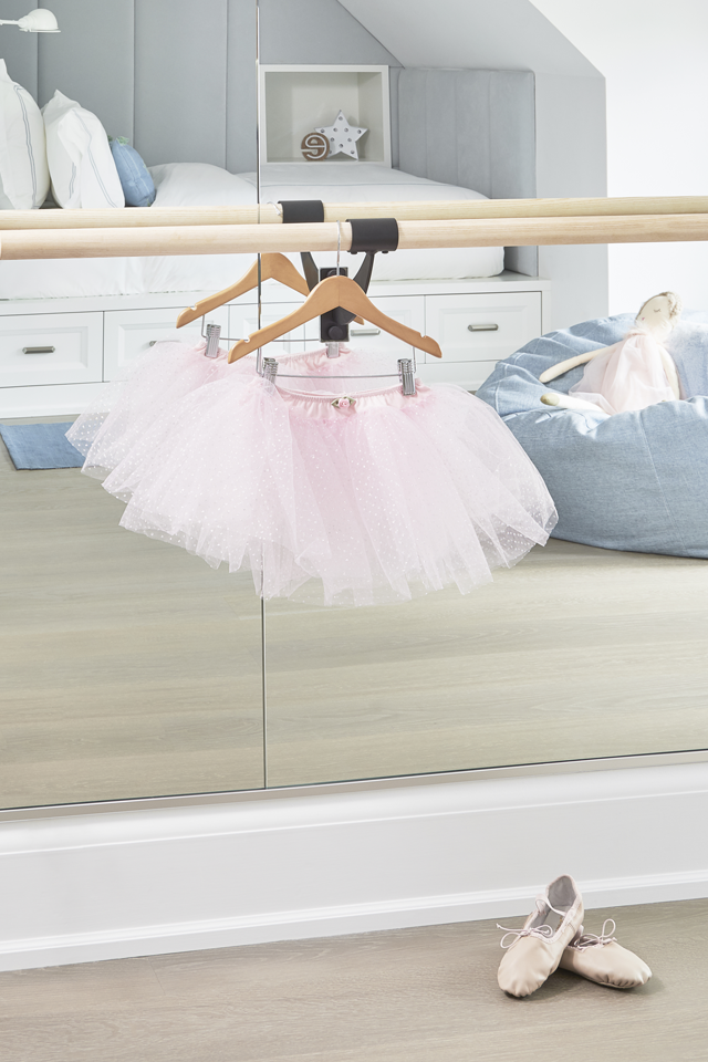
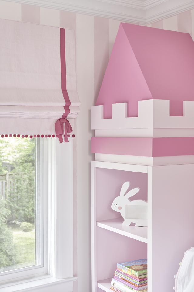
We always aim to incorporate some playful energy into every kid’s room that we design. Each space has some amazing design features, such as the princess theme in one of the rooms, the ballet barre in another, or the aforementioned and adored banana swing. But, overall, the rooms’ aesthetics are timeless and designed with room to grow.
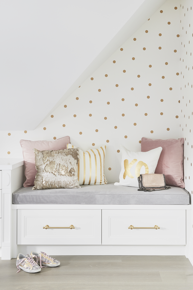
What would you consider are the top three things to keep in mind when designing rooms for children?
1. Know their tastes will change.
2. Know their functional needs will change, too.
3. This doesn’t necessarily mean you should prepare yourself for another redesign in a few years—which can prove both mentally and financially taxing. It just means the room’s design needs to be versatile enough to evolve with your child.
My advice is to choose versatile colors and finishes and items such as adjustable shelves and customizable organizing systems that can handle a growing child’s ever-changing needs. Multifunctional furniture is also my go-to whenever it’s an option.
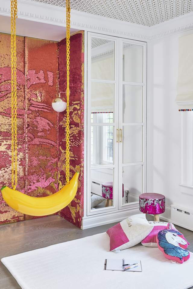
Children have a vast difference in taste, and we adore seeing their inner personalities shine. Can you tell us more about the inspiration behind this fun wall and banana swing?
The banana swing corner captures the vibe of the Miami Museum of Ice Cream—a vibrant and trendy tourist attraction and buzz-worthy selfie hotspot with candy-colored walls and a fun, quirky vibe reflective of Miami life.
Of course, the kids themselves are the ultimate sources of inspiration, both in their current personalities, and in the hints at who they will be a few years down the road. When designing a kids’ room, we always want the space to have a strong element of fun and playful energy, regardless of the child’s age. At the same time, we aim to achieve a sophisticated design that’s as long-lasting as possible.
Sara Bederman is the principal designer of Sarah Bederman Design. For over a decade, her bespoke design firm has become known for creating stylish, thoughtfully curated, and livable interiors. The firm provides residential design services for projects of all sizes, including city homes, lakeside retreats, and country homes. @SaraBStudio
Keep up to date on current trends, and get inspired by the best! Visit our, Beautiful Design Made Simple blog, for helpful design advice from experts.
