Enhancing Small Spaces
Jul 05, 2019 | Carpet One Floor & Home
Condo living certainly has its benefits and drawbacks. Living high in the sky above the streets of the city, often with little connection or access to the outdoors, makes the interior space of the condo the highest-priority element to design around. The low point of condo living can often be ceiling heights. With floors stacked one on top of the other, high ceilings in condos come at a high price. More often condos are designed with large, wide windows to compensate for the more intimate ceiling heights. In a recently completed project, we worked through this exact scenario. We problem solved privacy solutions for large windows and greatly enhanced the effects of a low ceiling height.

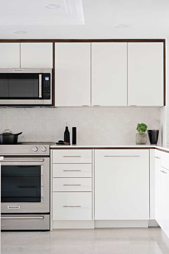
The clients were looking to renew their kitchen and master bedroom. When we first visited the home, I immediately sensed the areas of challenge. In this kitchen, I knew we had to give the space a lift, focusing more on the vertical lines. The kitchen is set in the interior of the condo, which means it has no windows. As a result, we amped up the lighting in the space, making sure the new kitchen was bright and well illuminated.
A generous amount of lighting is always a worthwhile investment. Once completed, lighting can be adjusted and customized as needed by simply adding dimmer switches to the room.
My first impression also confirmed that, overall, this kitchen needed to be bright and white. The clients have a contemporary aesthetic, as evidenced by their owning a number of modern furniture pieces, such as the Wishbone chair by Carl Hansen & Son. We went with a flannel door profile in a white high-gloss lacquer finish to add a reflective effect to the kitchen; the glossy surface adds a lively element to the interior. To soften this contemporary, stark-white cabinetry, we added wood-frame detailing in a walnut stain. Bringing this finish into the kitchen helped unify wood elements found in other areas of the condo. To create a more cohesive interior, I always look to existing spaces first for finishes and textures that might be worth repeating in the new design. We added a sleek and contemporary plaster crown molding to the cove ceiling in the kitchen. Plaster crown molding is most often quite traditional, but I do have a few favorite profiles that have straighter lines for modern interiors. Plaster crown molding adds a luxurious, elegant touch to any space. Being handmade by plaster artisans adds a lovely feature at the ceiling line and truly beautifies the space.
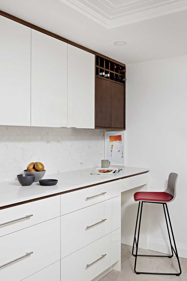
We vastly improved the layout of this kitchen. Here, we replaced a wall of full-height pantries and added a desk area in combination with a long run of countertop. The clients did not sacrifice any storage space in this process; in fact, with a more efficient layout and functional cabinet configuration, they gained a considerable amount of space and functionality.

I always prefer to add some natural elements to spaces we design. These elements add softness and interest that cannot be achieved with man-made finishes alone. In addition to the wood framing in this kitchen, we used a beautiful geometric marble backsplash. It sits quietly in the background and presents soft veining and slight color variation in the space as well as being complementary to the countertops. The client wanted hard-working counters, nothing that needed maintenance or was too precious to work on. Quartz, from companies such as Caesarstone, is a great option when this request is on a client’s wish list. We also went with natural materials for the kitchen floor, specifying a beautiful limestone tile. The honed patina and soft veining in the flooring ground the space and do not fight with the glossy finish of the cabinets.
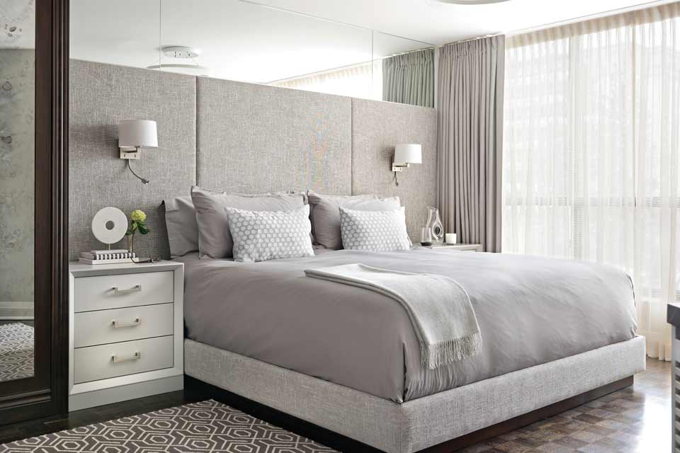
While we worked on a vertical line in the kitchen, the master bedroom presented a slightly different opportunity. With an existing large floor-to-ceiling wardrobe adjacent to the bed, I felt there was already enough vertical line to the room. As a result, we went for a long, low bed design with luxe wall panels. To manage the low ceilings in the bedroom, we added mirrors above the wall panels to reflect the light fixture above the bed. This mirror detail also lightens the space at the ceiling line and almost blurs the transition from wall to ceiling. Adding this mirror was something I knew we had to implement the first time I entered the room. Adding this detail was very successful because it creates the appearance of openness and depth, room, making the room feel larger. It also adds an unexpected detail to the bed area.
Because space is often at a premium in condos, we chose to use wall sconces rather than table lamps. The sconces have articulating reading light extensions as well as fixed, shaded bulbs. These lights are beautiful and extremely functional for the homeowner. We designed custom night tables to maximize every available inch in the bed area. They sit tightly between beautiful custom drapery on the far right and the existing wardrobe on the far left of the bed. Leaving no space wasted was a very important part of the design of this bedroom. To create a calm, balanced decor, we used soft-gray fabrics. The upholstered wall panels sit quietly behind the beautiful Italian linens. A geometric area rug and some interesting line detail on the new custom cabinetry in the space are the only dynamic elements.

Overall, we wanted to keep the decor quiet. So we designed additional custom cabinetry to manage media equipment in the space as well as a beautiful storage cabinet for personal items. We played with line and angles on these cabinets, combining wood framing with lacquered surfaces. All renewed elements feel unified and cohesive, offering greatly improved functionality. Beauty, functionality, and a sense of renewal make this bedroom a luxurious retreat above the busy streets of the city.
With a thoughtful design plan, you can live among the clouds in a space that will enhance your daily lifestyle. Every home comes with its own set of challenges and its own voice. As a designer, one of my favorite things to do is to read the language of the home and design with a sensitivity to the inherent characteristics of the space. This approach is guaranteed to elevate the interior to new heights.
Sara Bederman is the principal designer of Sara Bederman Design. For over a decade, Sara’s bespoke design firm has become known for creating stylish, thoughtfully curated and livable interiors.@SaraBStudio