How to Decorate with the 2022 Pantone Color of the Year
Apr 05, 2022 | Carpet One Floor & Home
Each year, Pantone comes out with their Color of the Year, based on design trends in a variety of industries. Typically, you’ll find the Pantone color of the year taking over fashion trends, product colors and of course, interior design. Since 1999, Pantone has chosen a color to represent the coming year and 2022 is no different. This year, Pantone’s chosen color is Very Peri – a bright shade of purple with red and violet undertones.
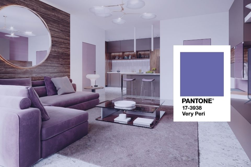
With purple being a color that isn’t commonly used in interior design, it can be challenging find ways to incorporate this brilliant hue throughout your home in a way that still matches your personal design aesthetic. Fortunately, it doesn’t have to be, and we have a few tips to get you started!
According to the executive director of the Pantone Color Institute, Leatrice Eiseman, “Very Peri displays a spritely, joyous attitude and dynamic presence that encourages courageous creativity and imaginative expressions,” and we couldn’t agree more. Adding some Very Peri inspired elements to your home is just the courageous creativity the color is meant to invoke, and we’ve created this simple guide to help you do just that.
Incorporate Very Peri On the Walls
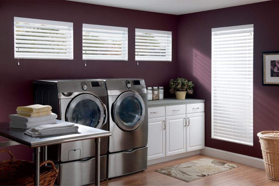
Graber Faux Wood Blinds
Purple can be an intimidating shade of paint, but if you find the right hue, it can be a beautiful color for an accent wall, or even the whole room. In the living room, a more subtle, grey-toned shade of purple might be best to go along with your décor. Whatever your design style, this pale purple hue gives an almost-neutral canvas, which can then be accented with brighter pops of color if you like to be bold, or with subtler colors like greens and browns for a more natural look.
In other rooms, like the laundry, bathroom, etc., you can get bolder with a deep purple-violet that is heavily saturated, but still not overpowering. Because this shade is a little darker, the heavy saturation is inviting, rather than overwhelming, and it gives even your run of the mill laundry room some pizzazz.
While we love to give recommendations for paint colors paired with rooms or spaces we think they look best in, however you choose to use this Very Peri inspired palette is entirely up to you and your design preferences. Different shades of purple will look better in different rooms depending on a variety of factors including natural light, size and tones of light sources. Design a space that is uniquely yours by getting creative with it –don’t be afraid to step (and paint!) outside of the box.
Use Purple Tones in Your Floors
Purple can be tricky to incorporate into your floors, but an area rug offers a seamless way to blend some color into a mostly neutral palette. Thankfully, area rugs are available in a variety of designs, sizes, and materials. For a more subdued look, there are Very Peri inspired rugs that utilize one or two bright shades of purple mixed with darker colors like maroons, mauves and browns to add dimension.
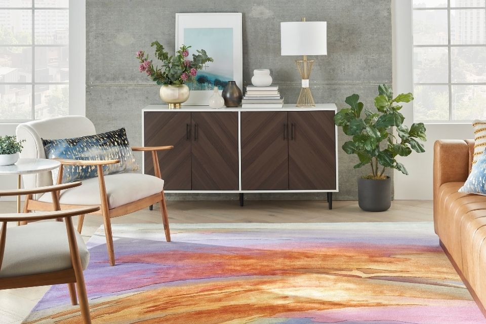
Nourison Multi-Color Area Rug
On the other hand, if your design style is a little brighter and bolder, an area rug that incorporates Very Peri with other bright colors and eye-catching patterns may suit you best. From afar, the purple may blend in with the other highly saturated hues, but up close it’s easy to see that this stunning rug includes many different shades of purple woven in – a prime example of including the Pantone Color of the Year in your home, but in a subtle way.
Find Pops of Purple Everywhere In Between
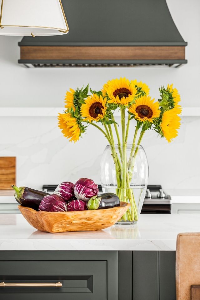
Design by PATTI WILSON Photography by JAMES LEE PHOTOS
Perhaps the easiest way to bring some Very Peri inspired elements into your home is with accent pieces and accessories. If you’re not ready to commit to purple walls or purple floors, it’s easy to bring in some smaller, impermanent purple objects, like blankets, pillows, curtains, or even just a bowl of purple veggies displayed on the counter. These elements are all no-commitment, and completely moveable, so if you decide you’d rather show off your Very Peri in another space or switch to a different accent color you can easily do so.
If you’re willing to commit a little more to bringing in Very Peri, consider bigger elements, like purple carpeting in the bedroom and a purple tile backsplash in the bathroom. You can even paint your kitchen cabinets purple or add statement chairs and artwork in the living room. These things, while more of a commitment than blankets or throw pillows, are still low maintenance and can be interchanged with other colors down the road.
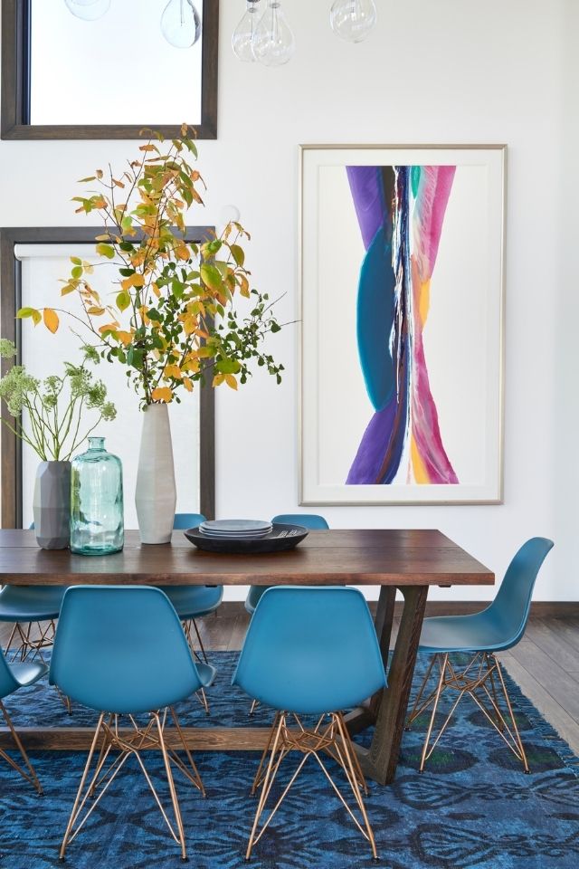
Design by SARA BEDERMAN Photography by STEPHANI BUCHMAN
Whether you’re using a pop of purple to brighten up a monochromatic space or adding Very Peri as another color to your rainbow oasis, incorporating the Pantone 2022 Color of the Year in your interior design is a trendy way to infuse your space with personality and fun. If you’re inspired to continue your home design journey, check out more design advice and exclusive designer content by reading our Beautiful Design Made Simple blog.